From the warm embrace of Pantone's 'Mocha Mousse' to the sunny optimism of butter yellow, this year's palette is a delightful mix of soothing neutrals, playful pastels, and vibrant accents.


Color is a powerful force that shapes how we experience the world around us, and in 2025, we’ve spotted seven trends set to make an impact. Over the coming year, we expect to see creatives reach for colors ranging from vibrant hues to playful pastels and soothing neutrals to spark emotion and capture attention.
From the nurturing qualities of ‘Mocha Mousse‘—the Pantone Color of the Year 2025—to the sunny optimism of butter yellow, these shades are all about comfort, luxury, and optimism. So, whether you’re seeking fresh ideas, looking to revitalize a brand identity, or are simply interested in the visual language of the future, let these color trends provide eye-catching inspiration!
1. Pantone Color of the Year 2025: Mocha Mousse
The Pantone Color of the Year announcement always sends ripples through the creative world; this year is no exception. For 2025, the Pantone Color Institute has whipped up PANTONE 17-1230 Mocha Mousse, a warm brown with the indulgent allure of chocolate and coffee.
As the name suggests, Mocha Mousse is all about comfort, reflecting a global desire for cozy indulgence and shared pleasures. But while some are embracing this soothing hue, others are less than thrilled. Our social media channels have seen comments ranging from “Oh God, here come the beige barbarians” to “Brain Rot Brown,” suggesting that this muted shade might not be everyone’s cup of tea (or coffee!).
Despite the controversy, it’s easy to see how Mocha Mousse will permeate the design world in 2025. Imagine cozy interiors, inviting homewares, and chic fashion pieces all-embracing this warm and comforting hue. And in the beauty world, where mocha shades are already a staple, this color is poised to become even more prominent.
Ready to explore the delicious possibilities of Mocha Mousse? Check out Envato’s range of mocha-inspired assets to infuse your next project with this comforting color.
2. Sunshine shades
Looking to turn up the energy and optimism? Then consult our guide to color psychology, and you’ll see that a splash of yellow is the answer. The lightest color on the spectrum, yellow, is uplifting and illuminating—which is why it’s often used in advertising and marketing campaigns. But while this color can evoke feelings of exuberance and fun, it’s important to remember that too much yellow can trigger anger, frustration, and anxiety. That’s because, as one of the longest wavelengths on the spectrum, it’s one of the hardest colors to take in.
This might explain why 2025’s comeback isn’t the bright, in-your-face yellow of years past. Instead, it’s softer, with more nuanced sunshine shades like lemon and butter yellow. And where neon pops of yellow appear, they’re quickly balanced with more mustard tones—like dating app Bumble’s website, which mixes the two colors to ensure an easy-on-the-eye user experience.
Regarding mustard, earthy yellows (ochre is another one) connect us to nature and bring a sense of warmth and comfort to design. This proves that yellows are surprisingly versatile and, depending on their use, can be calming and grounding or joyful and playful.
These are also great shades for ensuring something stands out. Premium department store Selfridges uses yellow to demonstrate that a prestige brand can still pack a punch in today’s crowded marketplace. In contrast, Snapchat uses it to communicate a point of difference from other social media platforms.
Ready to make the most of this mood-enhancer? The fashion world is, as always, one step ahead. Our spring/summer color palette round-up shows yellow popping up positively everywhere, from show-stopping butter-yellow gowns on the runway in Paris to spring-in-your-step lemon shades being spotted in London. You can even hint a bold mustard yellow here and there.
3. Burgundy and eggplant
Inject a dose of drama into your design work with rich, jewel-like hues that communicate luxury and carry an air of mystery. Sophisticated deep-red and purple shades like burgundy and eggplant counter the trending brighter colors and add elegance to everything they encounter, like ice cream brand Häagen-Dazs and its indulgence-focused campaigns.
These opulent hues evoke nostalgia for vintage glamor and historical richness but are also applied in modern, fresh ways. Just look at sumptuous seasonal collections from NARS for a blend of timeless elegance and contemporary cool.
This versatility makes burgundy and eggplant ideal for a variety of creative projects. Plus, they are increasingly being embraced as gender-neutral alternatives to traditional pink and blue, offering inclusivity and balance in design.
Discover more riches with our range of burgundy graphic assets, including backgrounds, patterns, and textures, to enhance your projects with this captivating shade.

4. Nautical, airy, and dusty blues
It’s not just nautical blues that will be making waves in 2025. We expect to see shades inspired by cloudless days and vintage denim bring tranquillity and timeless elegance to the design world.
These sky-and-sea blues give off a sense of serenity and connect us to nature. They offer a visual escape from the hustle and bustle of modern life. This is similar to the soothing comfort communicated by Nivea’s use of blue across its branding and product packaging.
But this trend isn’t just about creating a calming atmosphere that resonates with audiences seeking balance and peace. These versatile shades can also be invigorating and, over the past few years, have gained a modern edge, symbolizing technological innovation, digital immediacy, and the metaverse—like PayPal‘s use of blue, which conjures up images of payments flying through the sky and to people around the world.
Both classic and contemporary, these colors have been gaining popularity since the 2020 Pantone Color of the Year—Classic Blue—was announced. Look at our in-depth exploration of the shade for inspiration on incorporating it into your design and creative work.
5. Seafoam green
The seaside theme continues with a tone that taps into the rising trend of biophilic design, which focuses on incorporating natural elements into interior spaces. Reacting to today’s fast-paced world, people want to retreat to restorative environments, and because this soft tone evokes feelings of serenity, it often appears in interiors as a decorative accent or in artwork and textiles.
Graphic designers can also use this color to create peaceful and grounding spaces—like the calm channeled by fashion brand & Other Stories in its store decor, shopping totes, and social posts.
Whereas grey might once have been the neutral of choice, a growing desire for more color and personality sees seafoam green as a refreshing alternative. Sure, it’s still relatively neutral, but it also offers a touch of vibrancy, sophistication, and vintage charm as a shade reminiscent of the 1950s and 60s.
We deep-dive into this ocean-inspired shade (hex code #93E9BE, to be precise) in a post packed with seafoam color palette inspiration. Read it to better understand the colors that go with seafoam green and which variations of hues resonate with you.

6. Brights & bolds
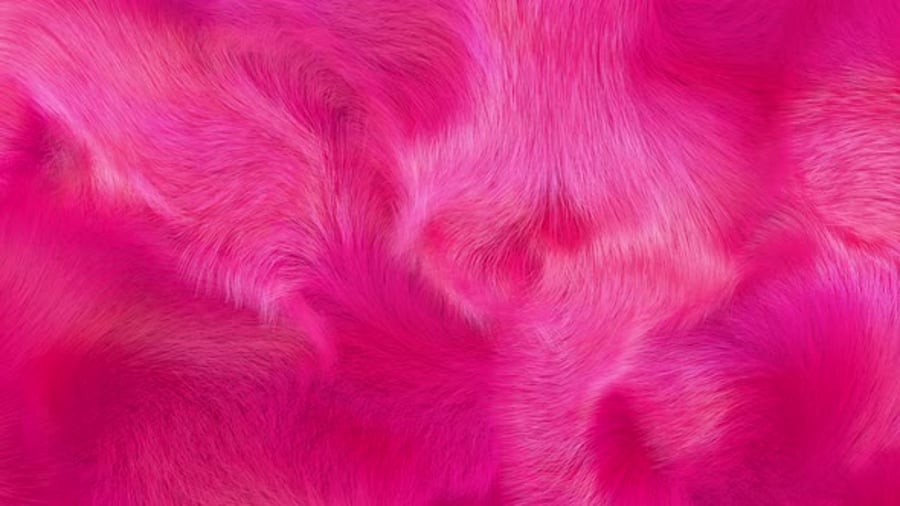
We’ve examined a few soothing shades, but vibrant tones will also vie for attention in 2025. We’re talking intense, saturated colors like marigold orange, fuchsia and hot pink, emerald green, and sapphire blue, which grab attention and energize the space in which they appear.
That’s why brands use bright and bold to boost mood and create a sense of optimism. For example, MasterCard’s overlapping circles rely on color symbolism to convey the message. From joyful yellow and stimulating orange to passionate red, these three colors represent consumers’ emotions toward what they want to buy.
And while we often think of using bold colors as accents, this trend sees them take center stage in celebrating individuality. Think of Hermes and its unapologetic orange branding. The warm shade is synonymous with the brand, from the logo to the instantly recognizable citrus-colored gift box. But it wasn’t always this way. A shortage of beige boxes saw the French fashion house opt for orange after the Second World War—proof that daring decisions can pay off.
With that in mind, use this trend to experiment with color blocking and unexpected pairings. Imagine marigold with teal or fuchsia with lime green. It’s about creating a vibrant and playful aesthetic. And don’t be afraid to play with patterns. We see brights and bolds in lively prints, from floral wallpapers with vibrant blooms to geometric rugs in contrasting and clashing hues.
Add a splash of color with our round-up of some of the best bright and bold templates. Focusing on contrasting colors and vibrant, saturated hues, we’ve shared tips to ensure designs stand out and explored some of Envato’s most inspiring, eye-catching, bright, and bold designs.
7. Pale pastel palettes
Looking for modern minimalism with a twist? Pastels are the answer. Bringing peacefulness and playfulness, gentle blues like sky blue or powder blue, soft pinks like blush or rose, delicate lavenders, and buttery yellows bring subtle personality without overwhelming the aesthetic.
Plus, they are perfect partners. For example, cupcake emporium Magnolia Bakery deployed a combo of dusty lilac, mint green, and shell pink to create a dreamy, sugar-coated website color palette. Pastels also complement neutrals like white, gray, and beige, allowing for layered and nuanced color schemes that work well in various design styles—on walls, online, in packaging design, and in outdoor advertising.
We’ve already seen how some pastel shades can come to define a brand—we’re looking at you, Glossier, with the hashtag #glossierpink revealing just how far this cool pink shade has captured people’s make-up cabinets and interior design imaginations.
Celebrate low saturation and subdued tones with our candy-colored pastel trend blog post, where we explore how associations with spring mean they can be used to represent abundance, growth, and peace, while also evoking a fun, youthful tone.
Start creating with this year’s color trends
Staying up-to-date with the latest trends is vital, as these hues will shape graphic design, branding, marketing, and consumer experiences throughout the year. By embracing 2025 colors like rich eggplant, seafoam green, and airy blues, you can create impactful, on-trend designs that resonate.
Explore Envato’s vast library of resources and curated collections to seamlessly incorporate these color trends into your projects. For more creative inspiration, explore our articles on web design trends, graphic design trends, and 3D design trends to stay ahead of the curve.


