If you love music and design, Storm Thorgerson is a name worth knowing — and remembering. Let's examine his iconic album covers and see how we can recreate his style in our own designs.


Storm Thorgerson had a knack for stopping people in their tracks.
His album covers were strange, bold, and full of attitude — precisely the kind of visuals you’d expect from the guy who helped define Pink Floyd’s iconic look. One minute, you’re looking at a sheep on a beach, and the next, you see a man bursting into flames during a handshake. That was the magic of Storm Thorgerson’s album covers: they made music feel like a visual puzzle.
Storm Thorgerson was a design pioneer and a unique talent. He created a catalog of Pink Floyd album cover designs for rock gods Led Zeppelin, Muse, and Biffy Clyro. So, let’s learn more about Storm Thorgerson’s artwork, his collaborative history with music’s biggest names, and how to emulate his extraordinary style in our creative projects.
Scroll down for Storm Thorgerson album covers and suggested creative assets to pay tribute to this master of musical style.
Who is Storm Thorgerson?
English artist, art director, and music video director Storm Thorgerson is best known for his long-term collaboration with Pink Floyd, for whom he created a range of iconic album covers during the 1970s and 1980s. His behind-the-scenes influence on rock and pop continued with album cover artwork for Black Sabbath, Led Zeppelin, and Muse. Shaping the look and feel of both popular and alternative music, he laid the stylistic foundation for music aesthetics, and his style is still emulated in music videos and album cover artwork today.
He was a pretty cool dude, described as the head of the gang (of his Pink Floyd pals), and had an unfailing eye for what would look jaw-droppingly good on an album cover.

Fusing psychedelia and surrealism with evocative fantasy landscapes, his work is both distinctive and difficult to pinpoint. There’s really nothing quite like it, but due to his vast influence, you can see many hallmarks of Storm Thorgerson’s artwork now used in contemporary design.
Storm Thorgerson was born in the English town of Potters Bar in 1944. While at school in Cambridge, he met Syd Barrett and Roger Waters, who would go on to found the progressive rock band Pink Floyd. Thorgerson studied English at university and went on to pursue a Master’s degree in Film and Television at the Royal College of Art in London.
In 1968, he founded the London-based graphic art group Hipgnosis alongside British graphic designer Aubrey Powell. The group created numerous Led Zeppelin album covers and cover artwork for iconic rock bands of the 1970s, including Def Leppard, T. Rex, Pretty Things, and Black Sabbath. During this time, Storm Thorgerson created some of his best-known album cover designs, including Pink Floyd’s The Dark Side of the Moon (1973).
Post-Hipgnosis, Thorgerson and Powell continued to collaborate, founding Greenback Films in 1982. The studio transitioned from record covers to music video production. The studio was short-lived, disbanding two years later. Thorgerson went on to co-found design studio StormStudios with graphic designer Peter Curzon.
Storm Thorgerson died in London in 2013, and he’s buried in Highgate Cemetery. At the time, his childhood friend, the Pink Floyd guitarist David Gilmour, released a statement describing him as “a constant force in my life, both at work and in private, a shoulder to cry on, and a great friend.”
Storm’s legacy continues, with StormStudios still producing album cover art, logos, typefaces, and promotional designs, remaining “busy creating ‘normal but not’ designs.” If you want to know more about Hipgnosis’s story, we recommend the fascinating 2023 documentary Squaring the Circle, which you can watch on Netflix.
What is the most famous album cover by Storm Thorgerson?
Storm Thorgerson’s album covers are recognizable for their distinctive, otherworldly aesthetic, but the best-known of his album covers is one of his simplest designs.
Fans love Pink Floyd for their ambitious art-rock music. Only a very different album cover style would have done justice to their unique position in the hall of music fame. Luckily, Storm Thorgerson was on hand when he created The Dark Side of the Moon album cover, inspired by a diagram of a prism with a beam of light projected through it, which he found in a physics textbook.

Often described as one of the best album covers of all time, The Dark Side of the Moon cover is simple, striking, and atmospheric, with the meaning of the colored lights said to represent three elements: the band’s stage lighting, the album lyrics, and keyboardist Richard Wright’s request for a ‘simple and bold’ design. Staying true to its minimalistic impact, the band’s name and album title don’t appear on the cover.
In fact, this Pink Floyd album cover broke with Storm’s penchant for surrealist photography. Wright apparently remarked, “Storm, let’s have a cool graphic, not one of your tatty (figurative) pictures. Not again, but something different.” Out of scathing critique came cover art genius.
The album went on to sell over 45 million copies, cementing its music and cover artwork as iconic moments in rock music history. So Storm really did have the last laugh on this one.
What other album covers did Storm Thorgerson design?
The most iconic Storm Thorgerson album covers include designs created for long-time collaborators Pink Floyd, trailblazing 1970s and 1980s musicians like Led Zeppelin, Black Sabbath, and Peter Gabriel, and later acts including The Cranberries, The Mars Volta, Muse, and Biffy Clyro. Here are some of the best album covers by Storm Thorgerson, including those from the Hipgnosis artwork era and later work from Storm Studios.
Electric Warrior (1971) by T. Rex
This album cover defined the mood of the start of the 1970s. Lead singer Marc Bolan is silhouetted dramatically with a gold, glowing outline, emitting cosmic energy and the glam rock spirit of the age. It’s a simple yet iconic album cover design by Storm in the early years of Hipgnosis.
This was on your bedroom wall if you were a teenager in the Seventies.

Technical Ecstasy (1976) by Black Sabbath
Thorgerson delicately described this in a 1979 magazine interview as depicting “some sort of mechanical copulation.” We’ll leave your imagination to fill in the blanks. In terms of the album artwork style, the design combines Art Deco aesthetics with distinctive 1970s cartoon-like illustration.

Go 2 (1978) by XTC
This album cover design features an essay about how album covers are used commercially to attract buyers. It is a rare example of Storm’s typographic work (he almost always preferred photography).
Perhaps Storm’s idea of a good joke, the essay leads the reader through the concept of how a compelling image sells an album, but in this case, the band rejected the idea. It’s a very cool and fitting tribute to the spirit of post-punk.

In Through the Out Door (1979) by Led Zeppelin
Inspired by a famous bar in New Orleans, Led Zeppelin’s eighth studio album included six cover variations, each featuring a scene of a man burning a letter in a bar. The albums were shipped in brown paper sleeves, making the variation a mystery to the recipient.
Fun fact: When the album cover is exposed to water, the image turns from vintage sepia to full color!

Peter Gabriel III [Melt] (1980) by Peter Gabriel
This unsettling album cover design features Gabriel’s distorted face, created using smudged Polaroid photos inspired by the work of photographer Les Krims. Creating the cover design was a collaboration between Hipgnosis and the artist, with Gabriel smudging the photographs using various objects, such as coins and matches.

A Momentary Lapse of Reason (1987) by Pink Floyd
One of Storm’s lesser-known album designs is our favorite, and it has a pretty interesting story. To try to achieve Storm’s perfect shot, a team installed about 700 Victorian hospital beds on a beach in Devon, UK. Beset by sudden rainfall and tidal movements, the album cover photo was completed during a second shoot, nine days after the first. So just remember this when you next use an AI image generator. Be grateful.
The album cover design for A Momentary Lapse of Reason reflects the meaning of the song, which poignantly addresses death, loss, and war.

The Division Bell (1994) by Pink Floyd
One of Storm’s most recognizable album cover designs is the pair of metal heads he art-directed for Pink Floyd’s fourteenth album, The Division Bell. Designed by artist Keith Breeden and built by John Robertson, the heads were assembled in a Cambridgeshire field, each the height of a double-decker bus. Depicted as if in conversation, the heads echo the album’s theme of communication.

Pulse (1995) by Pink Floyd
The Storm Thorgerson artwork for Pulse consisted of 36 photographs, melded together to create an impression of a large eye. One of Storm’s most contemporary record cover designs, the album artwork touches on themes of circularity and the passage of time, explored in Pink Floyd’s music.

Tree of Half Life (1997) by Pink Floyd
Storm continually revisited the natural world in his music artwork, perhaps none more so than in this design, which was initially intended for a band called Catherine Wheel but was eventually adopted as a T-shirt and book cover design for Pink Floyd. Based on a photograph of a tree on Hampstead Heath, the design reflects time and human connection to nature.
Remember that this image pre-dates more sophisticated Photoshop or AI image techniques, making its skillful execution even more admirable. Photo retoucher Richard Manning reflects on bringing Storm’s idea for the tree to life using a slow process of tracing and building up layers of individual branches:
“I received a scan of the tree photographed on Hampstead Heath, and a trace of the silhouette of the head. I scanned the trace and made a layer of the outline. The work was carried out on a small computer and not a lot of memory or RAM… It came down to using single twigs and branches and altering sizes or flipping them horizontally and making sure visually they couldn’t be seen as the same branch or twig.”

Bury the Hatchet (1999) by The Cranberries
One of Storm’s most emotive and disturbing album cover designs, Bury the Hatchet depicts an enlarged ‘all-seeing eye’ hovering over a naked, tormented soul. The barren desert and cloudless sky only enhance the sense that the person cannot escape its gaze. The more you look at it, the more you feel like you’re going a little bit insane…
But anyway, this cover design perfectly encapsulates Storm’s talent for lifting lessons from surrealism (you can spot the inspiration from the work of artist Salvador Dali) and transforming them into contemporary, pop-cultural images.

De-Loused in the Comatorium (2003) by The Mars Volta
How do you visualize an album about a man who enters a coma after overdosing on morphine and rat poison? Storm’s solution to this unique challenge was characteristically eccentric and spot-on, with a gold-illuminated head spewing out a beam of light against an eerie hospital backdrop.

Absolution (2003) by Muse
Storm did a few collaborations with the rock band Muse, with the first being the album cover for Absolution. Drummer Dom Howard contacted Storm, and the designer reflects on their meeting:
“We met with Dom and agreed that we should try and render our pencil sketch as a real event: shadows of flying people spread across the ground as if cast by a squadron of flying craft…It is as though he is witnessing some mystical event, a visitation of strange beings, which can only be inferred by us…He is deeply moved and experiences a kind of absolution as one might in the presence of a such a miraculous sight.”
— Storm Thorgerson in his book Taken by Storm — The Album Art by Storm Thorgerson.
In typical Storm style, nothing was digitized or Photoshopped — the entire cover was shot using huge cardboard cutouts of the figures erected on poles.

Late September (2004) by Deepest Blue
On this album cover design, which depicted a woman painted with blue contour lines on a beach in South Africa, Storm said:
“The idea came from something about ‘keeping tabs’, keeping up with the news, finger on the pulse, having your ear to the ground. I had also wanted to use a very large wave or tsunami ever since Dark Side of the Moon.”

Black Holes and Revelations (2006) by Muse
In one of the most familiar Storm Thorgerson art covers for younger audiences, Storm returned to collaborate with Muse again for Black Holes and Revelations. The concept for the cover was the Four Horsemen of the Apocalypse, representing modern evils. They are:
- Mr. Paranoia: In a suit of eyes, always watchful.
- Mr. Intolerance: Wearing a suit patterned with religious symbols.
- Mr. Narcissism: Wearing an outfit of many mirrors.
- Mr. Greed: In a suit of gold.
Interesting fact: Storm battled with the band to include the toy horses to nod to the origin of the idea, but the final cover removed an additional party of toy horses from the ground to the right of the table. The desert setting was also enhanced with color filters to resemble a Martian landscape.

Opposites (2013) by Biffy Clyro
Intended to depict the oldest living tree in the world, located in Chile, this album cover design involved building a model of the tree and transporting it to Iceland, where the photography shoot took place. The tree is hung with bones, indicating a tree of death rather than of life, and bent sideways with the force of an invisible gale or power.

What was Storm Thorgerson’s design philosophy?
Storm was recorded saying that album covers are “not enslaved to product… You don’t advertise the thing, you advertise what the thing is about.”
This is a good summary of his approach to creating cover artwork — Storm was an artist first, designer second, with commercialism set aside to create something interesting and unique.
He placed emphasis on art for art’s sake, exploring human psychology and emotion. He often looked to surrealism and pop art for stylistic inspiration. Above all, Storm was inspired by the music’s mood, lyrics, and atmosphere, often creating a seemingly random concept underpinned with deep symbolic meaning.
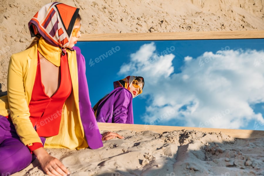
How can I recreate the Storm Thorgerson style?
Storm Thorgerson’s artwork style was unmistakably his, with a distinctive eye for the surreal and unexpected. However, he did revisit design elements in his work, so we can spot similarities between the covers he created for early rock acts like Pink Floyd and later musicians like Muse.
Storm was drawn to vast, open landscapes like deserts and beaches, which set the stage for his characters — often painted or nude — and their interactions with surreal objects like sculptures or disembodied facial features. There was always a story, but it was rarely obvious!

Use ImageGen to create images like this one, which pay tribute to Storm Thorgerson’s distinct style. Try this prompt:
Surreal desert landscape. Gigantic, hyperrealistic eye levitates over a small and frightened human figure, casting long shadows. Melting clocks and distorted cacti litter the sand. Dreamlike quality, vibrant colors, sharp focus, and clear sky.
A key aspect of Storm’s work is his experimental treatment of scale, with small figures contrasted against vast, epic landscapes. His legacy? Don’t be afraid to be playful with proportion, and pull together elements that might otherwise not make sense. A sheep on a sofa on the beach? A giant floating eye in the desert? Nothing is too off-kilter in Storm’s art style.
In your own work, try using these elements, as well as creative AI resources to pay tribute to Storm Thorgerson’s style when creating your own designs for posters, concept art, or branding projects.

Use ImageGen to create off-beat, rock album-worthy images like this. Try this prompt:
Surreal scene of a colossal shark silhouette suspended in a vibrant, twilight sky. Below, a desolate beach with crashing waves meets a horizon, a solitary figure gazes upward, bathed in ethereal light, conveying wonder and insignificance.
Or of course you could pay tribute to particular periods of Storm’s work. This one is evocative of his famous Pink Floyd album covers:

Use ImageGen to create Pink Floyd album cover tributes. Try this prompt:
Abstract prism radiating vibrant, refracted light against a dark, atmospheric background. Moody and surreal, with dramatic interplay of light and shadow. Emphasize ethereal qualities and unexpected color combinations for a dreamlike aesthetic.
Psychedelic backgrounds
Storm Thorgerson’s album covers often reference the psychedelic styles of the 1970s, with distorted backgrounds, liquid warping, and bold colors.
Surreal elements
With design elements inspired by the surrealist art movement, nod to Storm’s surrealist style. Look for disembodied eyes, floating stones, and ordinary objects out of place.


Desert landscapes
Storm loved contrasting his human figures against the stark backdrop of desert or ocean landscapes. The barren setting heightens the sense of emotion, bringing focus to the subject of the album cover, and it offers beautiful light for photography.


If you don’t have access to a desert (and how many of us do?), then AI image generators can be your friend here.

Use ImageGen to create surreal, Storm-style desert images like this. Try this prompt:
Surreal scene of neon pink dusty desert mountains, five eccentric wasteland scavengers intensely playing poker around a makeshift table. Characters clad in scavenged armor. Harsh sunlight, gritty textures, and a palpable sense of tension and desperation in the air, wide angle shot.
Otherworldly photography
Transport your album cover designs to another realm with futuristic photography. Look for subjects that feature aliens, models in off-beat settings, or otherworldly sculpture.


Explore more music design inspiration
The aesthetics of album covers redefined the music industry in the 1970s, and they continue to shape listeners’ emotional response to pop music today. Storm Thorgerson was one of the first designers to recognize the power of visual design to set the tone and build interest in an album release. Even though he claimed to be little interested in commercialism, his design skills certainly brought him and his studios a lot of success.
Inspired by the legacy of designers like Storm, many contemporary music artists, video creators, and movie directors have curated distinct aesthetics that significantly influence how audiences engage with their creative work. From the quaint, pastel-hued aesthetic of Wes Anderson to the future-nostalgic world of Star Wars, creatives can learn so much from how artistic directors curate the visual experience of film and music.
Build on Storm’s artistic legacy by exploring how to make your own photo-effect album cover, or delve further into the exciting revival of vinyl cover art. Or why not explore this Storm Thorgerson collection of curated elements for your design projects?


