Let's explore the influence of the Wes Anderson aesthetic and see some color palettes inspired by his movies.


Pastel-hued, obsessively symmetrical, and dripping with deadpan charm — the Wes Anderson aesthetic isn’t just a film style anymore; it’s practically a lifestyle. Quirky has never been so precise.
From Bottle Rocket in 1996 to this month’s much-hyped The Phoenician Scheme, Anderson’s visual signature has infiltrated everything: TikTok trends, CDK’s “Somebody That I Used to Know” video, and the cult-favorite Accidentally Wes Anderson Instagram account.
So if you’ve ever wanted your creative project to look like it was art-directed by Wes Anderson himself, then buckle up. We’re breaking down the core ingredients of the Wes Anderson aesthetic and showing you how to bring that cinematic charm into your own work.
Here’s what we’ll cover:
Let’s get weird. And symmetrical…
Key elements in Wes Anderson movies
The Wes Anderson aesthetic is known for its signature style of rich color palettes, symmetrical compositions, miniature sets, and a mix of vintage fonts. Here are the cheat codes to the main design elements of his work:
1. Carefully chosen color palettes
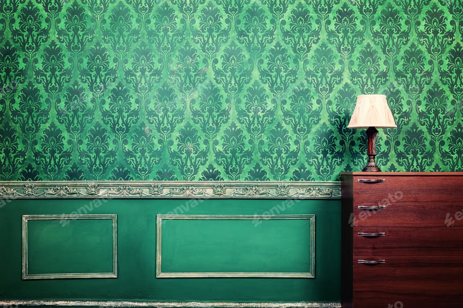
From minimalist pastel to warm monochromatic palettes, the color in Wes Anderson movies helps define the overall mood and period of the film. For example, the cadmium red, yellow, green, and blue color scheme of Moonrise Kingdom immediately sets the film at summer camp. Each film has its own distinct palette, as we’ll see later, but they all tend to feel slightly faded and vintage. In Wes Anderson’s world, even violence or chaos often happens in pretty colors.
2. Symmetrical compositions
Anderson chooses to shoot on one plane and pan horizontally and vertically. Because of this, he can create comparisons between two to four different subjects, especially when they appear on opposite sides of the screen. His overall mise-en-scène is to arrange color and set design in perfect symmetry throughout his films. As discussed later, we can see this especially clearly in Fantastic Mr. Fox.
3. Miniature sets
A large part of building the Wes Anderson world is to do with miniatures. Used for forced perspective and to incorporate a sense of wonder into his films, the seamless integration of miniatures can be seen in The Grand Budapest Hotel and in Fantastic Mr. Fox.
4. Vintage fonts
Wes Anderson picks fonts based on the overall film aesthetic and period. Script fonts like Tilda, the title font for Moonrise Kingdom, are used sparingly. Vintage-looking fonts similar to Hurson are sprinkled throughout his films. And sans serif fonts are used everywhere, including Wes Anderson’s favorite Futura as part of titles and background fonts.
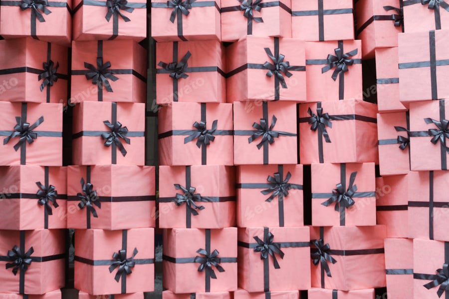
5. Meticulous prop placement
Every object in the frame looks intentionally placed. Nothing is random or left to chance, and objects in the background are often labeled, stacked, or lined up just so. From books and suitcases to gadgets, the props in these movies are almost characters themselves.
6. Retro design
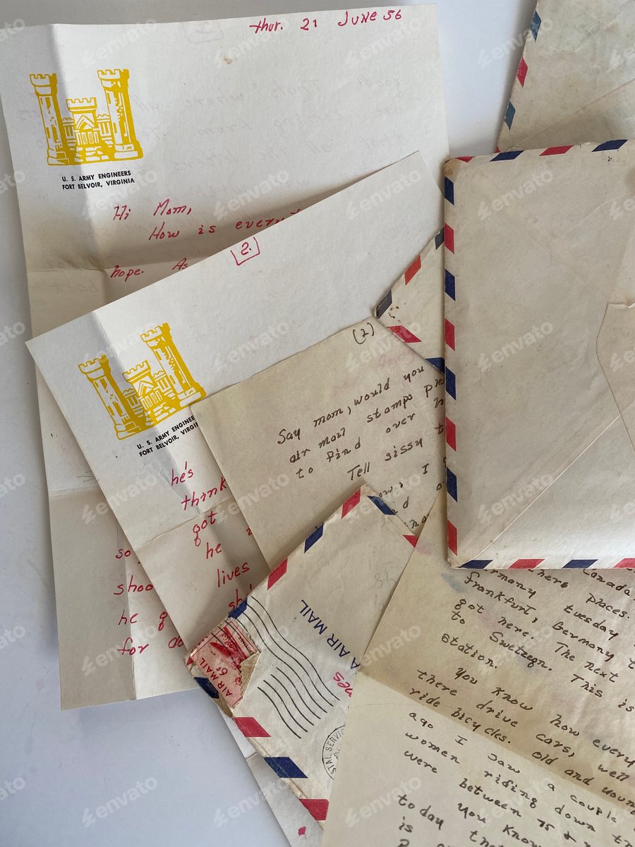
Although each film varies depending on the time period, you’ll often see some delicious vintage touches in a Wes Anderson movie, with obsessive attention paid to the details of each period. The movie sets often feel like time capsules from the 1960s or 70s, with rotary phones, typewriters, and old-school decor. And his interiors are rich in texture and detail — almost like dollhouses for adults.
Color palettes inspired by iconic Wes Anderson movies
Understanding the Wes Anderson is one thing; creating it is another. So let’s go through some creative assets and color palettes to help you turn inspiration into actual Wes Anderson-style designs.
The Grand Budapest Hotel (2014): Pastel colors and time-period aspect ratios

With a decidedly Wes Anderson color palette of sweet pastels punctuated with more realistic grays and creams, the unserious attitude of the film shines through, mixed with themes of ever-present military violence and lost love. The film follows concierge Gustave H. and his protege/lobby boy Zero — first as they provide top-notch service to the rich guests at The Grand Budapest Hotel, and later as Gustave is framed for the murder of wealthy guest, Madame D.
For a story told in four different timelines and three different aspect ratios, The Grand Budapest Hotel had the potential to be a chaotic mess. The clever use of aspect ratio and color grading unites each of the timelines into one clear and cohesive story. Each aspect ratio correlates to the timeline in which it was most used. For example, the Widescreen Cinemascope format (2.35:1), popular in the 1960s, was used for all scenes in the 60s within the film. By matching the aspect ratios, Wes Anderson flawlessly and subconsciously ingrains the idea that these scenes occur at their perceived time.
Each timeline also has a specific color grading special to each period. The 1932 timeline shows The Grand Budapest Hotel in its heyday with rich pink, red, purple, orange, yellow, and green tones. This timeline is sprinkled with cool grays and pastel creams to depict more serious themes such as Gustave’s jail time. The 1968 timeline shows Zero sharing his story with our narrator through similarly rich tones, slightly muted but with a wash of orange that conveys nostalgia.
The 1985 timeline shows our narrator and author of the book The Grand Budapest Hotel, sharing with the viewer the story that Zero told him. This timeline has a colder, even more muted palette as we move further and further away from the original 1932 story. The final timeline is at the graveyard of the author and narrator, where the tones have gone even colder and the color seems sucked out of the scene. A pink cast remains, keeping the warm memory alive.
Check out these LUTs to specifically emulate the color of nostalgia and energy in The Grand Budapest Hotel.
Moonrise Kingdom (2012): Summer colors and straight-shot symmetry

With a children’s book color palette, Wes Anderson art style symmetry, and summer camp elements, this coming-of-age film watches like a storybook. The cadmium yellow, grass green, sky blue, and burnt orange reflect the innocence of childhood and summer camp, which gives way to muted, rainy tones near the end of the film once childhood innocence is lost. The yellow wash throughout the film touches on the theme of nostalgia.
Precise and detail-oriented, the symmetry in this film lends itself to the storytelling, drawing parallels between characters, scenes, and the landscape. Wes Anderson’s film style symmetry is created through the placement of characters and objects, color balancing, and literal split screens. In a story where adults struggle to make sense of the world, sometimes even more than the children do, the straight shots and vertical/horizontal pans can be taken to create order in seeming chaos.
Like his films, Wes Anderson’s movie posters tend to be classic, vintage, and straightforward. The Moonrise Kingdom poster is no exception. It features all the main characters in the foreground, layered with a faded campground background and calligraphic text that brands the film even before viewing. Check out How to Design a Wes Anderson Movie Poster for a walkthrough on creating your own Wes Anderson poster!
Fantastic Mr. Fox (2009): Autumn colors, meticulous symmetry, and miniatures

This tale follows Mr. Fox, a retired robber; Mrs. Fox, his former partner; Ash, their 12-year-old son; Kristofferson, Ash’s cousin; and a neighborhood of friendly animals. When Mr. Fox enacts one final heist to end all heists by robbing humans Boggis, Bunce, and Bean, he threatens his marriage, family, and friends.
Possibly the most orange of his films, Fantastic Mr. Fox touts a warm Wes Anderson color palette except night scenes, where sky contrasts with a starry blue, and the character Kristofferson, who always wears a muted, light blue. While the film isn’t set in a specific period, the color suggests some time in the 70s due to the popularity of orange and warm hues. Because the character colors tend to blend in with their backgrounds, texture and symmetry are at the forefront of the Wes Anderson aesthetic in this movie.
Wes Anderson flexed his directing muscles to create this movie, where the mise-en-scène is perfectly meticulous, and no details or moments are lost. As in The Grand Budapest Hotel, scene backgrounds in Fantastic Mr. Fox are miniature sets where Wes Anderson expertly creates forced perspective, draws the viewer’s eye, and creates an entire world.
While in his live-action movies, the sets stand out as stylistic and hand-made against the human actors in life-size environments, in Fantastic Mr. Fox, the miniature stylistic environment becomes the world of the film that the characters blend into. Realistic fur, natural elements, bricks, wood, and paper become even more important when the color range is minimalist.
Also pushed to the forefront is his famous symmetry, making an appearance in almost every shot and determining the flow of the entire film. There is so much symmetry to compare and contrast characters, environments, and action that in the few instances where symmetry isn’t followed, it has a big impact. For example, the mayhem of a chase scene diverges from symmetry strategically to add to the chaos for larger impact.
The Royal Tenenbaums (2001): Rich color, imperfect symmetry, and Wes Anderson style fonts

Beautifully designed, The Royal Tenenbaums is usually pointed to as a clear description of Wes Anderson’s film style, from his rich color palette to his symmetry to his unserious treatment of serious themes. The Royal Tenenbaums is an homage to New York, a dysfunctional family, and its classic whimsy in a story where an unexpected family reunion results in many secret-revealing emotional breakdowns.
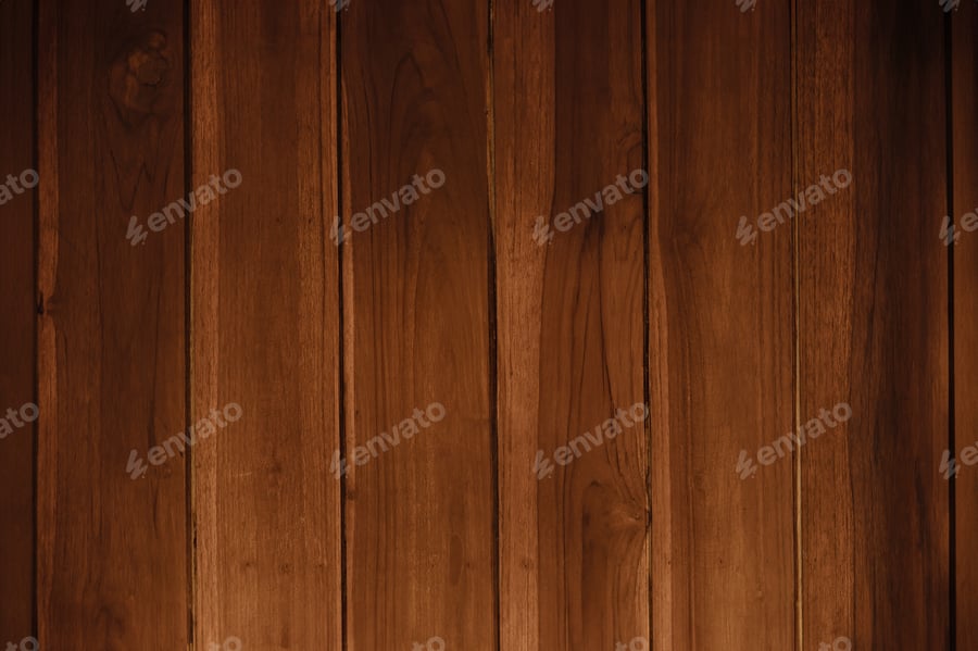
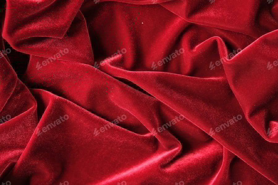
The house provides a backdrop of luxurious wood paneling and brilliant red that acts as a base for the characters to develop their personalities. This red is carried throughout the film and marks our characters from childhood onward by sister Margot’s red hairclip, brother Chas’s red tracksuit, and brother Richie’s tennis headband. The red constantly connects the family visually, no matter where the characters are.
The characters’ “uniforms” are up front and center as the shots introduce them in a straight-on portrait shot and repeatedly reinforce their clothing choices with more straight-on shots. By establishing this visual element, Wes Anderson creates an environment where any break from the norm of the characters’ “uniforms” encourages a strong emotional reaction. This happens when Richie makes a significant life change by cutting his 70s hairstyle and removing his headband.
Symmetry in The Royal Tenenbaums is sometimes very apparent, with a character in the center and nearly identical objects and color on each side. Other times, the symmetry is less obvious and is more about the balance of the overall shot. For example, in a shot where Margot is in the bathroom, sitting on the sink and painting her toenails, she takes up the left portion of the frame, while the beige door takes up the right half. At first glance, this shot may not seem symmetrical, but the beige color of the door is balanced by the beige color of Margot’s dress.
Wes Anderson is well known for his font choices in all of his films. Favorites include:
- Futura and other geometric sans-serif fonts
- Tilda and other hand-written fonts
- Archer and other vintage, typewriter-esque fonts
Before even watching a Wes Anderson movie, we can guess what it will be like based on the movie poster’s appearance. By choosing fonts that represent the feeling of his films, he establishes a visual style through his posters.
If you want to get into his posters further, you can join Jess and Ian as they rank every Wes Anderson poster from start to most recent over on our YouTube channel.
Celebrate the Wes Anderson aesthetic with Envato!
With captivating films like The Grand Budapest Hotel, Moonrise Kingdom, and Fantastic Mr. Fox, Wes Anderson has inspired and influenced cinematic visuals and professional design projects. With elements from Envato, you can find symmetrical balance, color themes, and realistic textures. Check out the collections Mise-en-scène: Whimsy and Symmetry and Wes Anderson for LUTs, photos, and more.
Discover The cinematic palette of Bong Joon-ho movies and the Studio Ghibli aesthetic for more movie-based design inspiration.


