Take a trip down memory lane and discover the eye-catching packaging designs that defined the 80s.


Never gonna give the 80s up, never gonna let the 80s down—especially when it comes to its distinctive packaging design! This era saw the rise of bold typography, vibrant color palettes, and innovative use of materials.
Referred to as the golden era of design, the 80s are well known for their blend of wild and vibrant styles, big and bold mindsets, and materialistic views that gave us ever-fresh packaging design ideas and iconic brands with staying power. Also known as the “Decade of Greed,” the 1980s was marked by the digital innovation boom, MTV music television, the rise of video games, and anything-goes fashion, making it a perfect study in product packaging design.
Futurism, minimalism, postmodernism, and avant-garde design styles were prominent in 80s packaging and blended together seamlessly, creating sub-styles and ultra-focused aesthetics. Explore the wildly ranging color palettes, futuristic typography trends, and trendy patterns to inspire your product design projects.
Rebellious patterning in Memphis design

When thinking about 80s product packaging design, Memphis Style comes to the forefront. Created by the Memphis Group, the design collective founded by Italian designer and architect Ettore Sottsass, Memphis Style touts an anti-functionalist approach, laminate and terrazzo materials, conflicting color choices, and offbeat, clashing patterns.
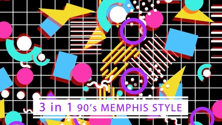
With loud color palettes mixed with classic black and white and a penchant for squiggles, Memphis denounced conventional linear, minimalist design and embraced postmodernism. While the group only existed from 1981 to 1988, those seven years of design choices became a driving force in product design. You can still see those squiggly shapes, eye-catching color choices, and distinct patterns in clothing, interior design, and art workshops today.
80s advertorial & the digital revolution

As you can appreciate from this color palette, hues such as sage green, beige, and vermilion red were often seen.
The rise of digital technology affected everything from design software to packaging, and it also fueled the consumerist mindset of the 80s. The digital revolution led to desktop advertorial publishing characterized by type-heavy, clean layouts, with informational, product-forward designs meant to complement minimalist, logo-heavy packaging.
Usually featuring condensed serif typefaces like Apple’s Apple Garamond on a clean, off-white background, these ads gave off the feeling of no-nonsense, useful products.
Because the necessary information was already in an ad, the packaging was able to stay minimal, reflecting a similar packaging vibe to Apple’s products today. Brands such as New Balance and Graza Olive Oi have recently revived this style, showing how it lends itself to letting creative product imagery shine and acting as a base for blending other styles.
Luxury & leisure—80s Deco

1980s Art Deco pulled directly from the grand arch patterns, glitz and glamor, and gold and black themes of 1920s Art Deco. With an extra colorful spin, 80s Deco aimed to revive the sleek, minimalist designs of the style that came before it and add its own flavor to the mix.
Society highlighted excess, luxury, and leisure in the Roaring 20s and again in the 80s, and packaging style followed.
The Miami Vice logo is a perfect example of the 80s Art Deco aesthetic with its angular lines, dual tones, and black drop shadow.

Synthwave, cyberpunk, neon, and sci-fi

Within the 80s futuristic product packaging genre lie many subsections of styles, including digital-driven synth-wave, cyberpunk, neon, and sci-fi. While each subsection describes a specific niche, they meld into each other and share characteristics, becoming a single futuristic aesthetic.
With top box office movies such as Tron (1982), E.T. the Extra-Terrestrial (1982), and Star Wars: The Empire Strikes Back (1980), the early 80s embraced the classic mix of future technology, space, and cyberspace.
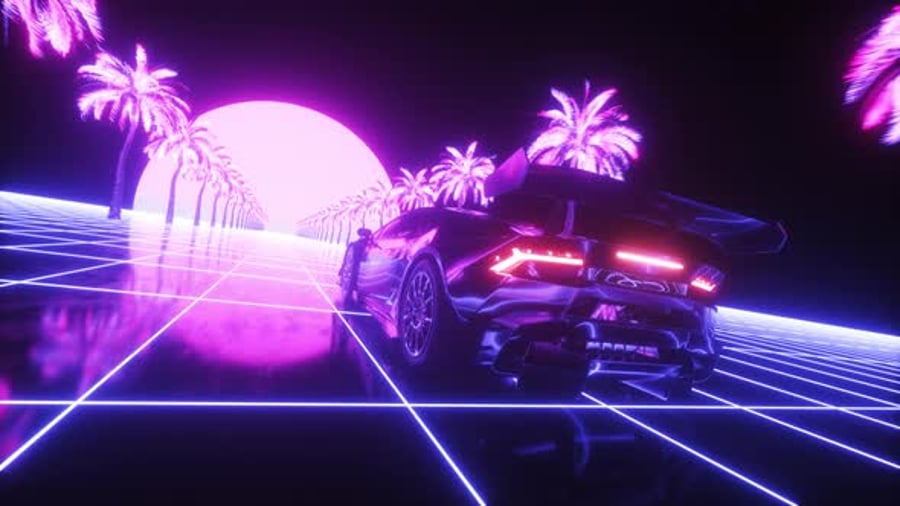
Movies, video games, and the music landscape all moved with the trailblazing technology, and product packaging followed in the form of album covers, VHS covers, movie posters, and video game cartridges.
Characterized by neon blues and reds, glowing grids, 3D or handwritten typography, and space images, the 80s futuristic style has helped solidify brands such as Metallica, Atari, and Disney.
Cartoons and characters in 80s illustration

From cartoon characters to vector fruit, 80s illustration was a part of 80s product packaging and is still used today. General Mills’ Pac-Man cereal, Coca-Cola’s Sam the Eagle cans, and Topps’ bubble gum juice cartons are all examples of successful product packaging based on illustrations.
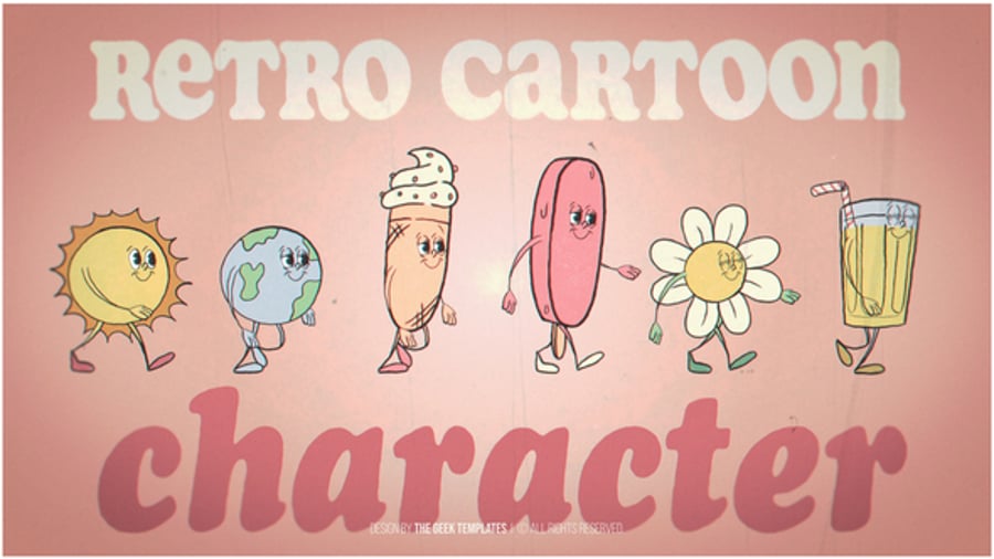
The designs center around the illustrations and are aimed at kids and adults alike. The key colors are a rainbow range of bright and punchy hues that easily capture consumers’ attention.
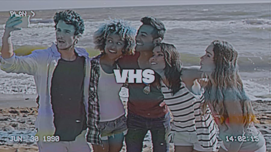
Rainbows and unusual shapes in avant-garde design

Interconnected with Memphis design, the avant-garde design style is a sister aesthetic sharing the experimental spirit of pushing art into new uses. Characterized by multi-colored streaks, innovative typography, and unusual shapes, the 80s avant-garde product design style found its home mostly on VHS tapes and album covers.
Today, the avant-garde design style and the Memphis design style have merged into a shared style of colorful, squiggly exploration complete with bright patterns and lines in a variety of different industries, including ceramics and interior design.
Draw from 80s product design styles to give your projects a retro feel!
With various large brands like Apple and Metallica built on 80s aesthetics, 80s product packaging design is a vast wealth of inspiration for influential, lasting projects. Delve into creative assets from Envato to emulate 80s aesthetics today.
For more product packaging inspiration, discover How streaming has changed movie poster design and Retro Design Trends: Create the 80s Style With Fonts, Text Effects, and More!


